If you are a formally trained graphic designer, it’s unlikely that you have not heard of Robert Bringhurst’s The Elements of Typographic Style, most recently updated to its fourth edition in 2012. Originally published 20 years earlier, the work is filled with answers to the book designer’s common conundrums: typeface choices, page arrangements, knowledge of terminology, and more are punctuated with memorable aphorisms (“The state of the art has more by far to do with the knowledge and skill of its practitioners than with the subtleties of their tools, but tools can constrain that skill or set it free” (179)) and accompanied by a 24-page list of notable type designers and foundries.
Bringhurst, who is a poet and linguist, modeled the book after Strunk and White’s famous The Elements of Style when he produced this desktop manual of sorts that has become a standard on Type 101 syllabi. Type designer Hermann Zapf (of “Dingbats” fame, amongst other classics) even declared that he wanted to see Elements become “the Typographers’ Bible”. However, writing about the work in the 2004 edition of his Modern Typography, designer and design historian Robin Kinross offers a counter position, choosing not to mince any words in the process:
as in any aesthetic judgement, there is a wider judgement here too. For all its learning, for all the width of its reference, Bringhurst’s book lacked a critical or historical sense. In this vision, concentrated so exclusively on the well-resolved product and neglecting the dimension of process (and thus the unfinished, the disputed, the failed and discarded), there could be no power of explanation. (175)
Kinross here raises an important consideration when it comes to designing for reading: process. This is a concept enforced regularly by Jan Tschichold in his important contribution to type canon, 1928’s The New Typography: A Handbook for Modern Designers. Kinross, who wrote the introduction to the 1995 English translation, notes that “it is clear that the New Typography could not, for Tschichold, be a simple matter of aesthetics: this category was always dissolved into a larger and more complex consideration of use and purpose” (xxv). This is not to suggest, however, that Tschichold’s work is some sort of laid-back version of Bringhurst’s: The New Typography is a manifesto on Modernism, eschewing serif typefaces and advocating for the use of standardized paper sizes, for instance.
• • •
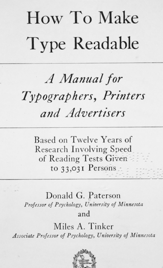
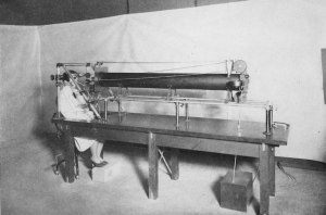
Fascinating to me—and why I’m writing all of this on a blog about the medical humanities—is that just as Tschichold was writing his Modernist treatise in Germany, two researchers in the Department of Applied Psychology at the University of Minnesota were embarking on what would end up being a decades-long project to use the methods most familiar to their field in assembling their own type manual. These researchers, Scott G. Paterson and Martin A. Tinker eventually published their findings in 1940 in the form of a 200-page volume, eloquently titled, How to Make Type Readable: A Manual for Typographers, Printers and Advertisers, Based on Twelve Years of Research Involving Speed of Reading Tests Given to 33,031 Persons. The book includes five appendices, 16 figures, and 61 tables, all brought together in the name of “a scientific typography” (xiv). My favorite of these accompaniments is the photograph of the “Minnesota eye movement camera” (4), featuring a high-heeled female figure staring down the length of a long tube, presumably with a lens at one end. It is unclear if she is the subject or the researcher.
You might recognize Paterson’s name from my post last month about the Visual Analog Scale. As a refresher, the applied psychologist worked with the Scott Company Engineers and Consultants in Industrial Personnel to develop the Graphics Rating Scale, “a new method for securing the judgment of superiors on subordinates” (Paterson 1922, 361). Eventually, this method for recording the measurement of the efficiency and capabilities of laborers and students found its way into today’s pain studies in the form of the Visual Analog Scale, a blank 10 centimeter line, usually marked with “No Pain” on one side and “The Most Pain I’ve Ever Had” on the other (a recent paper notes that more than half of all pain studies uses the VAS (Litcher-Kelly, et al. 2009)).
Typographic studies by psychologists was not a terribly widespread practice, but certainly not unheard of. Kinross, in Modern Typography, notes that “they approached the matter without the help or the interest of printers” and that “early legibility research had no effect on the practice of typography” (42). Still, the pair was prolific in their publications—the two co-authored 34 papers between 1928 and 1955 (Sutherland 2016, 14–25), and even if their work does not seem to have made it into the classic designerly works, a cursory Google Scholar search shows that How to Make Type Readable has been cited occasionally throughout the decades since its publication.
Kinross goes on to suggest that the sorts of work that Paterson and Tinker did (he never mentions them by name, but does note some of the works they reference) “has its own interest…in the field designated as information design” (42). And there is no shortage of examples of the use of eye-tracking mechanisms in refining the “user design” of a website or other media—including the development of “heatmaps” to show content developers where their users are looking first and for how long, so that headlines, meta information, and—critically—advertising can be placed for the greatest impact.
I would like to suggest, then, that a deeper interrogation into the homological relationship between user experience/information design and the types of studies performed by the likes of Paterson and Tinker would be a worthy project. Especially considering Paterson’s work in efficiency management and personnel science, we might come to recognize links between how our media are designed and presented today with how our bodies and emotions were measured and controlled in the past.
Works Cited